
Child Nation — Designing a Brand That Feels Like Play
Created by artist Jessica Wilson, Child Nation guides kids into imaginative adventures in real-world places using nothing but a device, their imagination, and the world around them.
I worked closely with Jessica to shape the brand identity, photography, design language and digital experience bringing to life a universe where children lead the way.
Creative Direction
Brand Identity
Website & UX Concepts
Iconography
The Challenge
How do you design a brand that feels like a child’s imagination, unpolished, unexpected, joyful while still feeling considered and beautifully made?
The Solution
My design approach was deliberately tactile and layered, watercolour textures, refelctive photography, playful iconography, all building a visual world that feels quiet but alive, handmade and slightly odd (in the best way).
My Role
Logo & Brand Elements
A brand built to feel like found treasure.


Organic, surprising and impossible to pin down.


Photography & Art Direction
Shot on location at Abbotsford Convent and State Library Victoria.
Muted and curious, these images hold a slight darkness, creating space for independence, mystery, imagination, and unexpected discovery


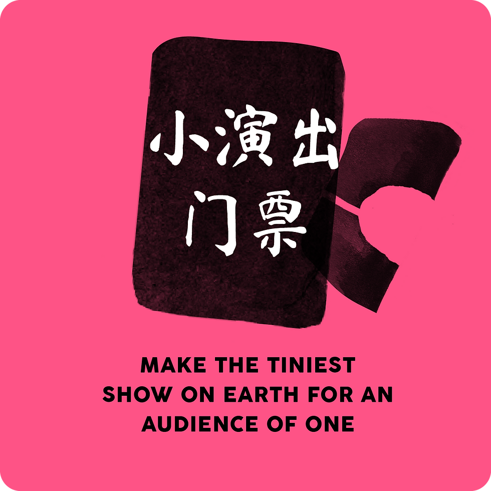
Journey Tiles / Adventure Icons
A visual language built for curiosity, wonder, and universal play
Each adventure in begins with a Journey Tile, a visual prompt that feels more like a mysterious artefact than a typical app button.
Designed to be abstract, playful, and slightly strange, the tiles invite curiosity without giving too much away. They resist literal explanation, allowing children to project their own meaning, imagination and interpretation onto them.
These tiles appear across the Child Nation platform, printed materials, and wayfinding signage, acting as visual anchors for each adventure.
True to the brand's global reach, the Journey Tiles are also designed to work across different languages and locations, using iconography and colour to spark recognition beyond words.


UX & Interface Design
UX that guides, but never gets in the way of imagination.
The Child Nation iPad interface was designed to feel simple, intuitive and just a little bit magical.
Built for kids aged 7–11, the experience guides them gently through each journey without overwhelming them with clutter or complexity.
Big bold text, tactile textures, abstract shapes and playful colour fields create a world that feels both digital and handmade staying true to the Child Nation brand.
Navigation is deliberately pared back. Clear prompts, visual breathing space, and moments of unexpected delight encourage kids to slow down, look closer, and stay curious.
This wasn't about gamification or loud digital noise, it was about creating a calm, imaginative interface that felt like an extension of the real-world adventures happening around them.


Design Features
Bold, minimal navigation with oversized touch points.
Text-driven prompts balanced with abstract graphic elements.
Colour palette drawn from the brand journey colours.
Space for pause, reading, and self-guided decision making.
An interface that feels like a quiet companion rather than a controller.

Signage
Shot on location at Abbotsford Convent and State Library Victoria.
Muted and curious, these images hold a slight darkness, creating space for mystery, imagination, and unexpected discovery


Drawer Handle Design
Design as invitation. Objects that ask to be touched, explored, and wondered about.
As part of Child Nation’s immersive installations, I designed a series of custom ceramic handles for the Journey Chest , a set of drawers children interact with during their adventures.
Each handle was intentionally odd, textured, or unexpected, designed to feel like little objects of mystery waiting to be touched, turned, and opened.
Some were lumpy, some smooth, some slightly strange — all inviting small hands to wonder what might be inside?
In a world where kids are so often told not to touch, these handles flipped that idea — turning the simple act of opening a drawer into an imaginative, sensory experience.


School Kit


Video
These videos were created to evoke the inner world of Child Nation, a place where children become the authors of their own civic experience.
Led the visual and narrative direction for these films, developing the look and feel through cinematic research, storyboards, and image references. Crafted the emotional tone: magical, intimate, exploratory. Assisting script development and the arc of each piece to reflect the quiet wonder and unexpected logic of a child’s imagination.
Jessica Wilson directed the shoots. Worked alongside her to ensure the visual storytelling stayed aligned with the conceptual world we had built. These are not traditional promos. They are poetic glimpses into a universe where children lead the way.
State Library Victoria
Abbotsford Convent